Nothing to See III
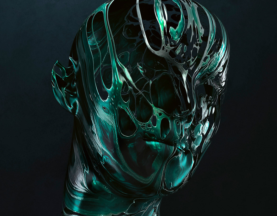
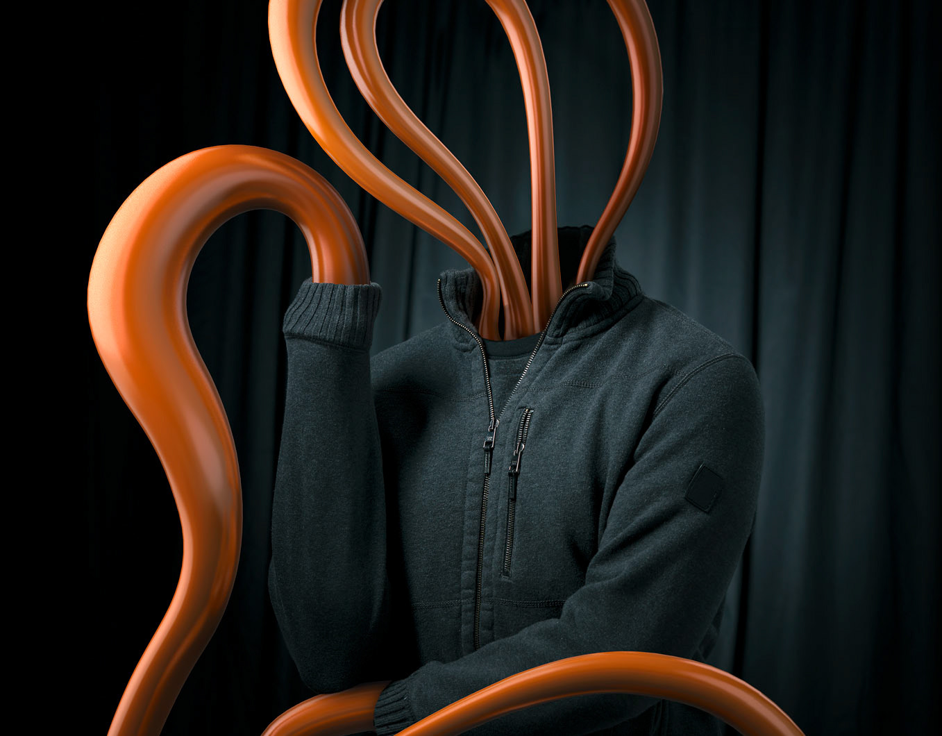
This latest project part of an ongoing series expressing my personal frustration with the current political landscape in the United States. While I am liberal, in this project I take no sides but rather try to raise the question, has truth and equality been replaced with deception and division? The interview included below from Heather Elder's Notes from a Reps Journal blog, is a great insight into my process.
What was the inspiration for this project?
I think I am moved to just express myself around the craziness that is happening in our country. I feel like we are living in a tv drama. It is surreal. I want to create something for people to think about. I am worried that some people have stopped paying attention and I want to keep them engaged in the political process.What is your connection to Alopecia and why did you choose to raise awareness for this common disease?
The answer to this question is two fold. My CGI partner Mike Campau has daughters with Alopecia and years ago asked if we could do a personal project together to raise awareness. We just never linked up, but when I did the first round of Nothing to See I needed a bald model to fit the role for the concept. I met Jeana Turner, she became famous as the runner up on America’s Next Top Model, she has Alopecia and for me was two both striking and completely inspiring. So after Nothing to See, I felt that I wanted to continue to use my skills to amplify my voice to share my concerns about our democracy.
I think in Nothing to See the hairless human form is mannequin like and represents all of us at the very stripped down core. We are all just forms, and the mannequin has been used to represent us in so many ways. So, for Nothing to See II, I wanted to continue to use the basic human form, and I wanted to use children. So we searched for subjects with Alopecia.
How is this an extension of the Nothing to See collection?
The connection to Nothing to See can be seen both in concept and form. Conceptually it’s still my expression of frustration and my attempts to use my creative platform to continue the discussions I started with Nothing to See; to get more people thinking and talking. Getting the eyeballs on the work through social is important part of these collections. So many people use social to say look at my cool life, look at my cool trip/food/girlfriend/sunset etc. I want to say “hey, wake up. Pay attention, think, talk, discuss.” By using a striking image that is complex and simple all at the same time I can get people’s attention.
Are these images exactly what you envisioned or did the execution evolve during the process?
These image are not exactly what I intended. The execution proved very difficult and the process is still not 100 percent finished (there are more coming) but that’s always the case. These are close. The pigment was very difficult and the body paint difficult as well, so technically it was all challenging. It’s a lot of work to pull these off so I am grateful to have a team of people that believed in the project and shared their creativity with me. There are always short comings in projects, they never really hit the mark completely, but really it’s just important to push yourself and failure is part of the creative process. These images have already created discussion so while they don’t quite meet my goal, they are communicating so they are successful.
What does the pigment represent?
The pigment represents truths. We have this insane new world where truth seems to not matter, I can’t ever remember when a leader could lie without recourse. We have media outlets and thought leaders that think it is ok to spread lies. The pigment represents the grains truths falling away one by one.
Why did you choose the colors you did?
The colors are intentional and represent the blue and red of the political landscape. The red states, the blue states, the red white and blue are obviously overt intentionally, as I feel that in order to get through to people it is best to be obvious. Art can be pretentious in its over complex metaphors etc. so at this time where there is so much noise I think being simple, clean and direct speaks loudest. My favorite it purple because it introduces the idea of meeting in the middle. Both sides are culpable in or country and we need to find the middle so we can get back on course.
Why include black and white images?
They are not black and white images, the models were painted black and white. They represent the division and the binary nature of our society. Everything seems to have sides so I wanted to show that there are tones and grays and that not everything is black or white.Your instagram references that the human form without hair represents humanity at its most basic form.
Poet, hip hop artist and Blindspotting writer, Rafael Casal, said “I’m an artist, so my job is to reflect the times, to provide language for the conversation.” I know you feel the same way, so what response do you hope your work elicits?
I just hope people take a moment to connect with the images and what they represent and then are moved to get engaged or stay engaged in our political process. If I can get 100 people think about the images and then discuss them with someone else, it’s a win. Who knows, maybe they will inspire someone else to create something to keep the conversation going. Maybe they will inspire some to share their story, to volunteer, to vote. It doesn’t really matter as long as it elicits some sort of response.
Models: @jeanaturner @kailiasa and @courtneyv_21 on instagram
Digital Artist: @mikecampau and @alexeyadamitsky
Makeup: @lana_chromium

